Style Slider: Background, IsSnapToTickEnabled, AutoToolTipPlacement, TickFrequency : Style « Windows Presentation Foundation « C# / C Sharp

Home
C# / C Sharp
1.2D Graphics
2.Class Interface
3.Collections Data Structure
4.Components
5.Data Types
6.Database ADO.net
7.Design Patterns
8.Development Class
9.Event
10.File Stream
11.Generics
12.GUI Windows Form
13.Language Basics
14.LINQ
15.Network
16.Office
17.Reflection
18.Regular Expressions
19.Security
20.Services Event
21.Thread
22.Web Services
23.Windows
24.Windows Presentation Foundation
25.XML
26.XML LINQ
C# / C Sharp by API
C# / CSharp Tutorial
C# / CSharp Open Source
C# / C Sharp » Windows Presentation Foundation » StyleScreenshots 
Style Slider: Background, IsSnapToTickEnabled, AutoToolTipPlacement, TickFrequency
     
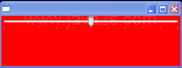
<Window x:Class="ScrollBarCustomThumbSize.Window1"
    xmlns="http://schemas.microsoft.com/winfx/2006/xaml/presentation"
    xmlns:x="http://schemas.microsoft.com/winfx/2006/xaml"
    xmlns:sys="clr-namespace:System;assembly=mscorlib" 
    Title="" >
    <Window.Resources>
        <Style  TargetType="{x:Type Slider}">
            <Setter Property = "Background" Value = "Red"/>
            <Setter Property = "IsSnapToTickEnabled" Value ="True"/>
            <Setter Property = "TickPlacement" Value ="BottomRight"/>
            <Setter Property = "AutoToolTipPlacement" Value ="BottomRight"/>
            <Setter Property = "TickFrequency" Value ="1"/>
        </Style>


    </Window.Resources>

    <Grid>
        <Slider></Slider>


    </Grid>

</Window>


Related examples in the same category
1.Double value as the Font sizeDouble value as the Font size
2.FontFamily resource constantFontFamily resource constant
3.Styles With Same KeysStyles With Same Keys
4.Setter With Binding to SliderSetter With Binding to Slider
5.Style With Data TriggerStyle With Data Trigger
6.Styles With Target TypesStyles With Target Types
7.Style With Multiple ElementsStyle With Multiple Elements
8.Style With Multiple ButtonsStyle With Multiple Buttons
9.Style With ResourceStyle With Resource
10.Style With Property ElementStyle With Property Element
11.Style With TriggersStyle With Triggers
12.Normal: Origin at upper leftNormal: Origin at upper left
13.Stroke Start Line CapStroke Start Line Cap
14.Property TriggerProperty Trigger
15.Using a Style resourceUsing a Style resource
16.Sharing a StyleSharing a Style
17.Ignore an Implicit Style by setting Style to NullIgnore an Implicit Style by setting Style to Null
18.Set a Style ProgrammaticallySet a Style Programmatically
19.extends StyleSelector to create your own style selectorextends StyleSelector to create your own style selector
20.The default GroupStyle indents the items in a groupThe default GroupStyle indents the items in a group
www.java2java.com | Contact Us
Copyright 2009 - 12 Demo Source and Support. All rights reserved.
All other trademarks are property of their respective owners.