<Window x:Class="WpfApplication1.Window1"
xmlns="http://schemas.microsoft.com/winfx/2006/xaml/presentation"
xmlns:x="http://schemas.microsoft.com/winfx/2006/xaml"
xmlns:ds="clr-namespace:WpfApplication1">
<Window.Resources>
<ObjectDataProvider x:Key="myDateCollectionDataSource" ObjectType="{x:Type ds:myDateCollection}"/>
<Style x:Key="GridViewColumnHeaderGripper" TargetType="{x:Type Thumb}">
<Setter Property="Height" Value="{Binding Path=ActualHeight,RelativeSource={RelativeSource TemplatedParent}}"/>
<Setter Property="Template">
<Setter.Value>
<ControlTemplate TargetType="{x:Type Thumb}">
<Border>
<Rectangle HorizontalAlignment="Center" Width="1" Fill="Black"/>
</Border>
</ControlTemplate>
</Setter.Value>
</Setter>
</Style>
<Style x:Key="myControlTemplateStyle" TargetType="{x:Type GridViewColumnHeader}">
<Setter Property="Template">
<Setter.Value>
<ControlTemplate TargetType="{x:Type GridViewColumnHeader}">
<Grid Background="LightBlue">
<DockPanel HorizontalAlignment="Center" VerticalAlignment="Center">
<CheckBox></CheckBox>
<TextBlock Text="{TemplateBinding Content}" FontSize="16" Foreground="DarkBlue"/>
</DockPanel>
<Canvas>
<Thumb x:Name="PART_HeaderGripper"
Style="{StaticResource GridViewColumnHeaderGripper}"
Background="Transparent"
/>
</Canvas>
</Grid>
</ControlTemplate>
</Setter.Value>
</Setter>
</Style>
<Style x:Key="myHeaderStyle" TargetType="{x:Type GridViewColumnHeader}">
<Setter Property="Background" Value="LightBlue"/>
</Style>
<DataTemplate x:Key="myHeaderTemplate">
<DockPanel>
<CheckBox/>
<TextBlock FontSize="16" Foreground="DarkBlue">
<TextBlock.Text>
<Binding/>
</TextBlock.Text>
</TextBlock>
</DockPanel>
</DataTemplate>
<DataTemplate x:Key="myCellTemplateDay">
<DockPanel>
<TextBlock Foreground="DarkBlue" HorizontalAlignment="Center">
<TextBlock.Text>
<Binding Path="Day"/>
</TextBlock.Text>
</TextBlock>
</DockPanel>
</DataTemplate>
<DataTemplate x:Key="myCellTemplateMonth">
<DockPanel>
<TextBlock Foreground="DarkBlue" HorizontalAlignment="Center">
<TextBlock.Text>
<Binding Path="Month"/>
</TextBlock.Text>
</TextBlock>
</DockPanel>
</DataTemplate>
<DataTemplate x:Key="myCellTemplateYear">
<DockPanel>
<TextBlock Foreground="DarkBlue" HorizontalAlignment="Center">
<TextBlock.Text>
<Binding Path="Year"/>
</TextBlock.Text>
</TextBlock>
</DockPanel>
</DataTemplate>
</Window.Resources>
<StackPanel>
<ListView ItemsSource="{Binding Source={StaticResource myDateCollectionDataSource}}"
HorizontalAlignment="Center">
<ListView.View>
<GridView>
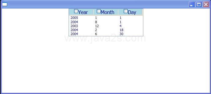
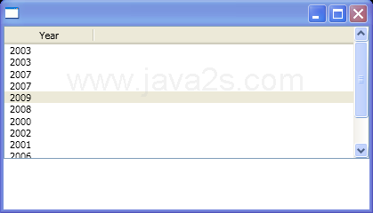
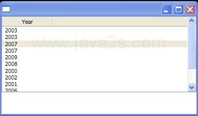
<GridViewColumn Header="Year" Width="80"
HeaderContainerStyle="{StaticResource myHeaderStyle}"
HeaderTemplate="{StaticResource myHeaderTemplate}"
CellTemplate="{StaticResource myCellTemplateYear}"/>
<GridViewColumn Header="Month" Width="80"
HeaderContainerStyle="{StaticResource myHeaderStyle}"
HeaderTemplate="{StaticResource myHeaderTemplate}"
DisplayMemberBinding="{Binding Path=Month}"/>
<GridViewColumn Header="Day" Width="80"
HeaderContainerStyle="{StaticResource myHeaderStyle}"
HeaderTemplate="{StaticResource myHeaderTemplate}"
CellTemplate="{StaticResource myCellTemplateDay}"/>
</GridView>
</ListView.View>
</ListView>
</StackPanel>
</Window>
//File:Window.xaml.cs
using System;
using System.Windows;
using System.Windows.Controls;
using System.Windows.Data;
using System.Windows.Documents;
using System.Windows.Media;
using System.Windows.Shapes;
using System.Windows.Controls.Primitives;
using System.Collections.ObjectModel;
namespace WpfApplication1
{
public partial class Window1 : Window
{}
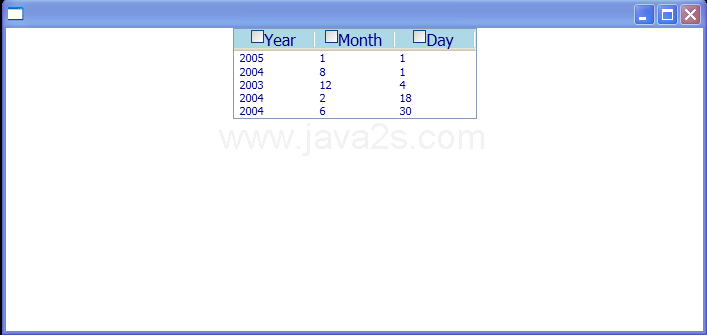
public class myDateCollection :
ObservableCollection<DateTime>
{
public myDateCollection()
{
Add(new DateTime(2005, 1, 1));
Add(new DateTime(2004, 8, 1));
Add(new DateTime(2003, 12, 4));
Add(new DateTime(2004, 2, 18));
Add(new DateTime(2004, 6, 30));
}
}
}
|